Showing posts with label yellow. Show all posts

Monday, 28 April 2014

default setting...

 at the beginning of april i declared that i had 4 quilts to complete by the end of the month. since it is still not quite the end of the month i can live in false comfort that i can still achieve this.
reality is...

not a hope in hell!!

having said that, I am 2 1/2 down and 1 1/2 to go...but even at my crazy rate, that's neigh on impossible.

so what has been holding me back i hear you ask?

well there has been the little thing of "the book". there were a few nips n tucks and tweaks that needed attending to but a couple of weeks ago it went off to the printers so all we can do now is wait!


i am beyond excited and beyond nervous about it in equal measure. it's my baby...and everyone wants their baby to be loved and adored, right? criticism is so hard to take...so be kind!

the publishers have been brilliant. it has all been such a journey and such a steep learning curve but i think they got me down to a T...they most certainly have with the front cover anyway. i only saw this complete for the first time today on Amazon and coincidentally i posted this picture below earlier today on Instagram talking about my default colour setting. i think there is little arguing now about this...one and the same! i do try to work in something fresh and different, but no matter how hard it always comes back to this. i guess i just shouldn't fight it. it's not such a bad default setting after all.


meanwhile back to the April Must Dos...no more book excuses, so let's just see quite how much we can do in the next 2 (2?? really?? only 2??) days...


Tuesday, 10 December 2013

a nice day for finishing a quilt...

2 miracles happened today...

1. i finished a quilt that had been sitting on a pile waiting patiently for its turn since january and...

2. it was sunny enough to take a stroll across the road to the park to shoot a few pics of it.

the quilt in question was my scrappy trip along quilt below, which was my xmas vacation project last year. 

oh so embarrassing to be about to embark on this year's xmas vacation and still have it unfinished. having found an unusual free gap in my week i finally set about to finish it.


there is actually something rather nice about revisiting an unfinished project...memories are wrapped up in it...you get to revisit and rework with fabrics that you may not be anymore.

advantages galore...and that's my story for being a lazy a*** and i'm sticking to it.


im so so pleased with how it's turned out and hopefully ruby, who it was originally made for, is still keen on it too.

i had a fun little photo shoot in the park...dodging the dogs and the wind (weather wind not the dogs' wind) and to show you a few more of the photos i have attached a little flipagram here, which may or may not work. i have never made one before, but have fun with it if it does!


what finishing this quilt has taught me is...

1. i can be a finisher...
2. i actually enjoyed being a finisher...
3. i really really must finish more things before i start anything new.

that last one is my new year's resolution...good luck with that huh?

oh and that first picture at the top?...
that's a sneak of a commission that i have been working on and is about to head off to its destination. just as soon as i can i'll tell you more about that one!

Tuesday, 13 August 2013

in familiar territory...

 this may look a little familiar...
giant hexie quilt in blues and greys...with yellow binding...

a customer was so taken with the original that she wanted me to make a replica.
fine by me...i'm a bit partial to this colour combo.


this is a replica with a difference however, as who has the exact same fabrics in their stash 2 years later?
evidently not me.


the lovely thing about doing the same thing again but different is that it gives you chance to try things a little differently that you didn't think of first time round.


like the binding for instance.
not having the same lotta fabric for the binding meant nothing else quite worked for me. 
so instead i opted for scrappy...result!
this was particularly pleasing on the back which was kept more simple with this fab ikea piece.

 and then there was the quilting...
i jumped in rather quickly first time and did a simple tracing of the hexies in zigzag lines. this worked thanks to some additional hand quilting but without that it needed something different.
i remember being bowled over by Laura's concentric circles quilting on her fantabulous scrappy trip along quilt and thought that would work here...fun but not too fussy. (just realised i've used the same backing as laura too!)ikea

so one replica giant hexie quilt with a difference done...


...one customer deciding she wants one bigger!

the good news is that i get to do a take 3...who knows what improvements will be made on that one.
the other good news is that this one is in my etsy shop for one lucky buyer looking for a pretty quilt...go check it out here.

the other good news is that i am so pleased to be back in familiar territory with my giant hexie pattern that i think that is the first thing i am going to make when i get my hands on some of Leah Duncan's tule...can't wait for that.


Saturday, 27 July 2013

pretty practical...

 yesterday began with a quick much needed project.

the loo door is half glass and when we first moved in i put up a temporary scratty piece of fabric to tide us over...that was 9 years ago now...ahem...


every time i sat on the loo i was reminded that i really needed to rectify this.
9 years is obviously plenty of time to decide just what i wanted up there.

having played around with doily prints recently and having developed a recent penchant for this colour ways having been inspired by this print i put 2 and 2 together and whipped up this piece of fabric.


it was a case of layering up the colours using the lovely warm sunshine to speed up the drying process...

it started with pale pink...followed swiftly by some ochre...


and finally a splash of gunmetal grey.


4 stitched edges and an insert of ribbon and i'm wondering why it took my 9 years.


i'll have time now to think of other things while frequenting the littlest room in the house.


Tuesday, 2 July 2013

what's in a name?

 i have been printing up a new design today that i have been working on.
 i never really quite know how a design on paper is going to turn out when it is printed up but i am really rather pleased with it.


i am however a little bit stumped with what to call it. while i was drawing it out i had an idea in mind but it hasn't ended up looking quite like i thought it would and so that name won't work.


fancy helping me out with a name? 

i am going to give a panel - in either yellow or turquoise - to the best name. Fancy winning one? just leave your suggestion here (or on IG...i have it going on there too) and the name that wows me the most will win a panel in the colour of their choice.


so get your thinking caps on and thanks for helping!


Friday, 17 May 2013

swoon...

 being the world's best starter and the world's worst finisher it will come as no surprise that i have started yet another quilt.


to be fair i am on a mission to make a quilt for our bed. i keep thinking i have found the perfect quilt design but then as i get going on it it doesn't seem quite as perfect as i thought so i give up.


i really thought this low volume scrappy trip along above was going to be just right...

...wrong! even though it is low volume there is just too much going on.

the same happened with the + and x quilt below.


way too busy!
it was back to the drawing board but not before i made myself sew up these scrappy and plus blocks into squares big enough to make cosy floor cushions.

now i can relatively guiltlessly get on with the job in hand of making the right quilt and i actually think i am there this time.

i had bought camille's lovely swoon pattern a while ago and had a lightbulb moment of thinking this would be just the right quilt, particularly if i kept it simple.
the first block i made at the top went pretty straight forwardly. i used my 2 favourite fabrics of the moment - architextures' crosshatch in grey and pb&j's raspberry jam in picnic. the background is the crosshatch in white...plain but with a little added interest.


i was really pleased with the result of this first block and started pulling fabrics for the rest of the quilt.  whilst our room has a strong Orla Kiely wallpaper with a shot of chartreusy yellow i initially wanted to keep the quilt neutral.
not according to my sub conscience as before i knew it i'd dragged out some yellows. looks like it was going to have yellow in it after all.


just to make sure yellow was going to work i made up another block. 
nice...
i was liking...

but now i have a dilemma...a big dilemma...
i laid the blocks out on the bed just to see if it was working for me and boom how good do the blocks look as pillow covers??

aaaghhh!
do i stop at these 2 blocks and do something else for the quilt?
but what else would work in this room?
what would you do??


Monday, 13 May 2013

triangular sweethearts...

 it's that time again...


 i love exhibiting at the Saltaire Makers Fair as it is full of lots of wonderful talented makers and it has a reputation for the visitors expecting quality handmade work.


as normal i haven't got myself particularly well prepared for the event so am trying desperately hard now to rectify that and make plenty of my usual favourites as well as having a few fresh new lines to show.


a few weeks ago i printed my first stencilled heart tea towel in orange and finally today managed to print some more in a couple of other colours.


this will be their inaugural outing so it will be lovely to see how they are received. to date i have printed them up in the tangerine, a sunshine yellow and then a greeny-turquoise. the greeny-turquoise was today's happy accident. i had printed the yellow first and went over the screen with my regular turquoise and hey presto a lovely seafoam colour. i love it! i've been trying but failed to mix this colour for ages. don't you just love happy accidents?


i think i will stick with these 3 colours...
unless of course there's a colour that you think i must print it in...all suggestions on a postcard pleas...or simply left as a comment.

and of course i couldn't just leave the design as tea towels...
there are t-shirts for your little sweetheart too!


if you live in the vicinity and are looking for something great to do this forthcoming Bank Holiday then please do come visit. the Makers Fair is part of the Saltaire Arts Trail so there will be lots to see and do. it would be well worth a special visit even if you live a bit further afield.

...and if you aren't able to be there then you can always pick up one of my new tea towels in my Etsy shop. (t-shirts will be available there v soon)


Thursday, 17 January 2013

printing...an update...

a very quick printing session this morning to give my new colours a try out and to get it out of my system.
I would only have been thinking about them all day if I hadn't...


you know me...you know I would.
some adjustments need making...
the one I am most pleased with, surprisingly as it isn't a colour I normally use, is the lilac. it is really soft but has enough personality to not be over powering.

 the green is okay. I would like it a tad lighter and more of a yellowy green.
as for the yellow, it is a lot brighter than I was aiming for. I must remember than colours always come out brighter on the fabric. much more white needed in the mix in this one.
it is all a big trial and error exercise.
although there is really no error as I can always make use of the fabrics...
and...
my tester sheet is looking pretty in the process.
 UPDATING an update:

just thought i would do a little show and tell of my playing around with these new shades in my repertoire...
dumpling pouches seemed a quick and easy and fun way to try them out...
what do you reckon?


(fantastic dumpling pouch pattern courtesy of Michelle Patterns)

Wednesday, 16 January 2013

wordless wednesday...almost...

   mixing colours...


   thinking of spring...


   pale and delicate...


   floral fresh...


   wonder how they will look when printed up?


Wednesday, 3 October 2012

bribery time...

I would really appreciate your opinion...
I'll make it worth your while...
well you read the heading...Bribery Time.

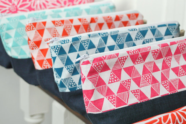
As you know I have been working on my screen printing range for this Autumn/Winter and have developed the 2 colour-ways - Utility above and Frozen Berries below and within that Triangle Mania and Scruffy Daisy.


I have 3 big fairs coming up and so need a lot of stock and obviously I want the right stock for my customers as all the fairs will be a "see it and buy it now" kinda affair, rather than the ordering kinda scenario.

So the question is, what would you choose? If you could pick any 3 items that you are drawn to, either for yourself or thinking ahead as Christmas gifts what digs it for you? Is there a particular pattern? A certain colour? A favourite pouch? I really would greatly appreciate your thoughts on this, my little in house market research buddies.

 So what's in it for you, I hear you ask? Obviously I know you aren't that kind of person and you are happy to just help out I hear you cry, but everyone is entitled to a little reward and I insist.

So, two things. 

The first is if you leave me a comment with your thoughts I'll email you a code for 10% off your next order (so be sure to link to an email address).
Secondly I'll enter you into a draw to win a little selection of your suggestions. Ah, sneaky huh? Now you have to think about what you like, not just be random, because one of you is going to be lumbered with the said pieces.


Seriously though, I really appreciate the time you take in helping me with this.

Thank you! x

Giveaway open until Sunday evening (oh and talking of which, there's still time to enter my fab giveaway from M is for Make...go check it out if you haven't already entered.)

Tuesday, 14 August 2012

Familiar colours...

It was back to the more familiar colours of yellow and grey today, with a little random orange and brown thrown in.


 Printing my triangle design in white on various coloured Konas had been on the To Do list for some time and was needed to be pushed up the pecking order with autumn/winter thoughts in mind.


 I love how the coloured fabrics have taken the white ink, altho when you compare the 2 ways below (white ink on coloured fabric or coloured ink on white fabric) I am not totally sure you can tell the difference with this design, can you?
What I think it does give me is the flexibility of colour. Paint colours are much more limiting than the huge array of choice of Kona solids, so printing in white ink does allow me to get the perfect colour. I mean who wants Tomato when you can get Tangerine? Seriously, who?

Being the impatient soul that I am I had to see if things would be any different when I made it up into products and again, I'm not totally convinced they are.


Along with the vast choice of colours with Kona, the other advantage of printing with white ink is I can print in lots of colours at once without having to wait for a screen to dry first. This has to be a big plus. 
So unless you have a huge problem with this set up, I think I will be printing with white ink for the foreseeable future.